WebsitesStorefront
Onewheel Tire Guru

Every rider knows which board they have, and the board decides which tires fit. Matt Feige's brief for his Onewheel Tire Guru storefront asked for a simple scrolling homepage with tire shopping up front, so that's where this draft starts. It's an unpublished Shopify design. The link below goes to Matt's current public site, which is a different version.
Board first, then tires
The board and tire choices are visible from the top, without a string of introductory pages in front of them. A tire photo can look great and still be the wrong part for your board, so every product carries a clear name and its fit before the page asks anyone to decide.
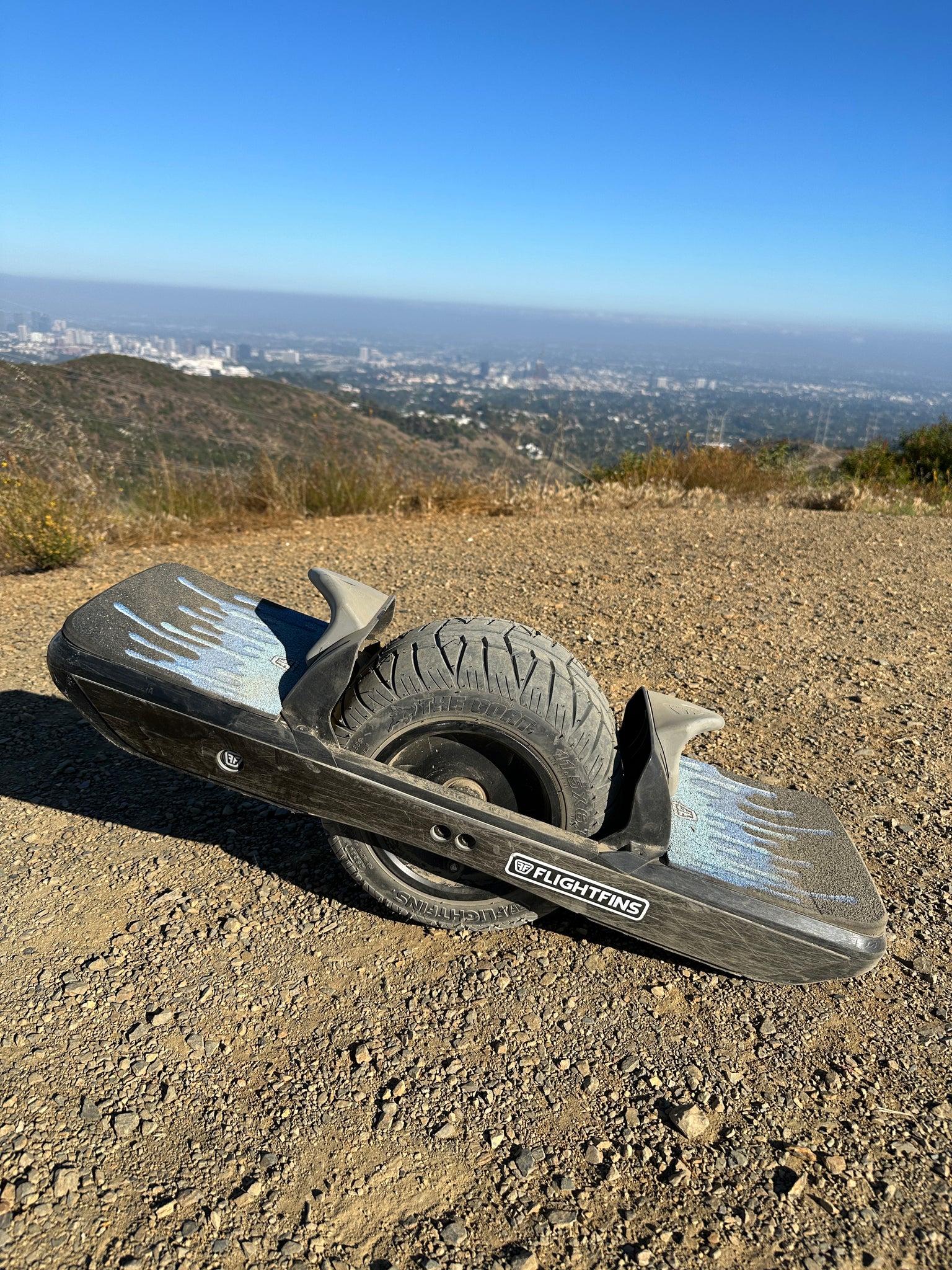
Matt's brush strokes, his real workshop
The draft uses Matt's logo, his brush lettering and his blue strokes. I set the lettering up so it stays crisp at any size and still reads as real text instead of a picture of words.
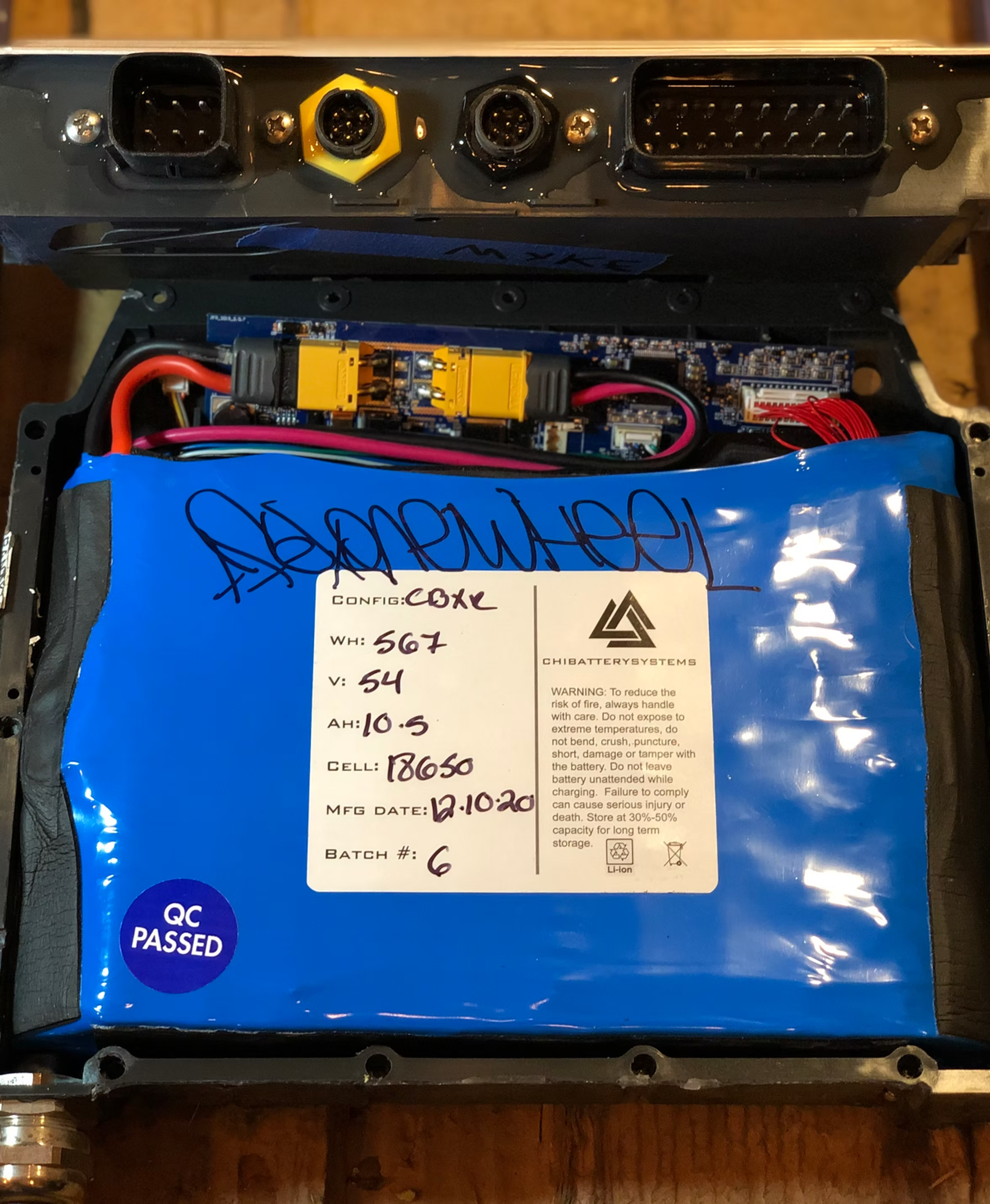
An earlier version was a cream-and-teal study. As it developed, I moved toward a more image-rich page using photographs from the actual workshop: real components, boards mid-repair and the place where the work happens. A compact header lets more of that show when the page first loads.
More than tires
Farther down there's room for repairs, upgrades, parts, send-in service and custom builds, since someone replacing a worn tire often has something else to sort out. Tire Guru has a real workshop and a riding audience, so photographs of the boards and the community sit among the products and break up the rows of cards.
I designed the Shopify storefront around tire selection, board models and the way riders shop.